1. Introduction
The goal of this assignment is for you to show that you can do the following in R:
- Download and load data from a dataset available online
- Filter, recode, and summarize data using tidyverse
- Visualize those data using ggplot2
- Run and interpret standard OLS regression models
Much that is required to complete the assignment has been covered explicitly in the DataCamp and class exercises. Some small gaps may exist, however, where you will have to use Google search, or the tidyverse or ggplot2 documentation online. If you run into major roadblocks, however, consult with your peers, and please feel welcome to talk with or e-mail me.
Note: You can write and submit the assignment on your own, or in groups of 2 or 3. Do not worry about the page length. Your assignment (whether on your own, or in a group of 2 or 3) will very likely be relatively short, and that’s perfectly alright.
2. Downloading and loading the data
For this assignment, you will be using a large-scale survey of Americans that was conducted during and after the 2016 US Presidential election. There are two major election surveys in the United States: the American National Election Study (ANES), and the Cooperative Congressional Election Study (CCES). You’ll often see these referenced in the academic literature. In this assignment, you will be using data from the 2016 CCES. Instructions concerning how to download and load the data are below.
Downloading the 2016 CCES data
- Go to https://cces.gov.harvard.edu
- Click on “CCES 2016 Data/Guide” on the menu on the left.
- Data: Download the file “CCES16_Common_OUTPUT_Feb2018_VV” by clicking “Download” and then selecting “RData format”.
- You can also download the file in other formats, but RData (a format specific to R) is easier.
- If you download the .RData file, the full file name will be “CCES16_Common_OUTPUT_Feb2018_VV.RData”.
- Codebook: Download the file “CCES Guide 2016.pdf” by clicking “Download”.
- The codebook will tell you the names of the variables in the dataset, and the survey question and response categories corresponding to each.
Loading the 2016 CCES data in R
- In RStudio, create a new
.Rfile and save it so that you don’t lose your code. Save frequently while doing your assignment. - In your .R file, start by loading the
tidyverseandmodelsummarylibraries, e.g.library(tidyverse).- If one or both of these libraries are not installed, install them, e.g.
install.packages("modelsummary").
- If one or both of these libraries are not installed, install them, e.g.
- Load the CCES data as follows:
setwd("Path_to_the_file/")
load("CCES16_Common_OUTPUT_Feb2018_VV.RData")- Where
Path_to_the_fileis the location that you saved the file on your computer.
- Where
- We haven’t used the
load()function in class, but it’s simply the way to load an.RDatafile, which is R’s native format. This is just likeread_csv()is to csvs, andread_dta()is to dta files. - Using
load()to load the CCES dataset will load a newdata.frameinto R calledx.- If you type
names(x), for example, you should see all of the variables in the data, each of which will correspond to those listed in the codebook.
- If you type
- I suggest you rename the data.frame
xto something else (with a capital letter, as by convention)- For example, the following code will create a copy of
xin a new data.frame calledD;rm(x)will then remove the original data.frame. Thereafter, you can simply useDas your data.frame for the remainer of the assignment. Feel free to call the data.frame whatever you want, or usexas is.# Copy the data.frame x into a new data.frame D D <- x # Remove the old data.frame x rm(x)
- For example, the following code will create a copy of
- If everything is working correctly, typing
names(D)—or whatever you renamedxto—will print all of the variable names in the dataset.
3. Assignment setup
To begin the assignment, you are required to first choose an attitudinal or behavioral variable (i.e. not a socio-demographic variable) from the 2016 CCES codebook that you think will be predictive of voting for Donald Trump. The variable you choose should be continuous, binary, or ordinal (i.e. not a categorial variable with more than two categories). For example, you could choose a variable that measures how often someone attends religious service, or feelings toward African-Americans, or support for Chinese tariffs. The options are manifold. You should, nevertheless, have a good intuition or theory for why the variable you select would explain variation in voting for Trump. (you cannot use ideological self-placement, i.e. CC16_340a, as in the example)
As an example to demonstrate the requirements of the assigment below, I will use the variable CC16_340a—ideological self-placement—which was asked of respondents as follows (p. 84 of the codebook):
How would you rate each of the following individuals and groups? (Yourself)
- 1 Very liberal
- 2 Liberal
- 3 Somewhat liberal
- 4 Middle of the Road
- 5 Somewhat conservative
- 6 Conservative
- 7 Very conservative
- 8 Not sure
- 98 Skipped
- 99 Not asked
4. Assignment requirements
Once you have loaded the data, created an .R file, and selected a variable from the data, you are ready to begin the assignment. The assignment will consist of the results you produce for the four sections below. Please structure your assignment by including the title of each section as written below.
4.1 Variable description
Note: This section will likely require around 1-2 paragraphs of writing (in addition to your table and graph).
In this section, you will simply provide a description of your variable of interest (i.e. the variable that you have chosen to use from the CCES dataset).
- To begin, state that your assignment will explain the relationship between the variable that you have selected, and voting for Donald Trump.
- Explain why you expect your variable of interest to be associated with voting for Trump (or Clinton). You needn’t explain this in great detail, but your theoretical expectations should be relatively clear. (you do not need to provide academic citations for this, however)
- State your empirical expectations more formally as a hypothesis.
- E.g. H1: The more conservative one is, the more likely they will be to vote for Donald Trump.
- Calculate and provide a table of the relevant descriptive statistics for your variable of interest depending on its type (e.g. mean, median, standard deviation).
- Provide a graph of your choosing that you think best shows the distribution of your variable of interest.
- You probably will want your y-axis as a percentage (if a bar graph) or as a density (if a histogram). If you need a percentage, just remember you can create a percentage variable by dividing a count for a category by the sum of the counts (then multiply by 100).
- Use your best judgment to improve the graph by, for example, labeling the axes, changing the size, color, and fill of elements in the graph, etc.
- Include this graph in your assignment.
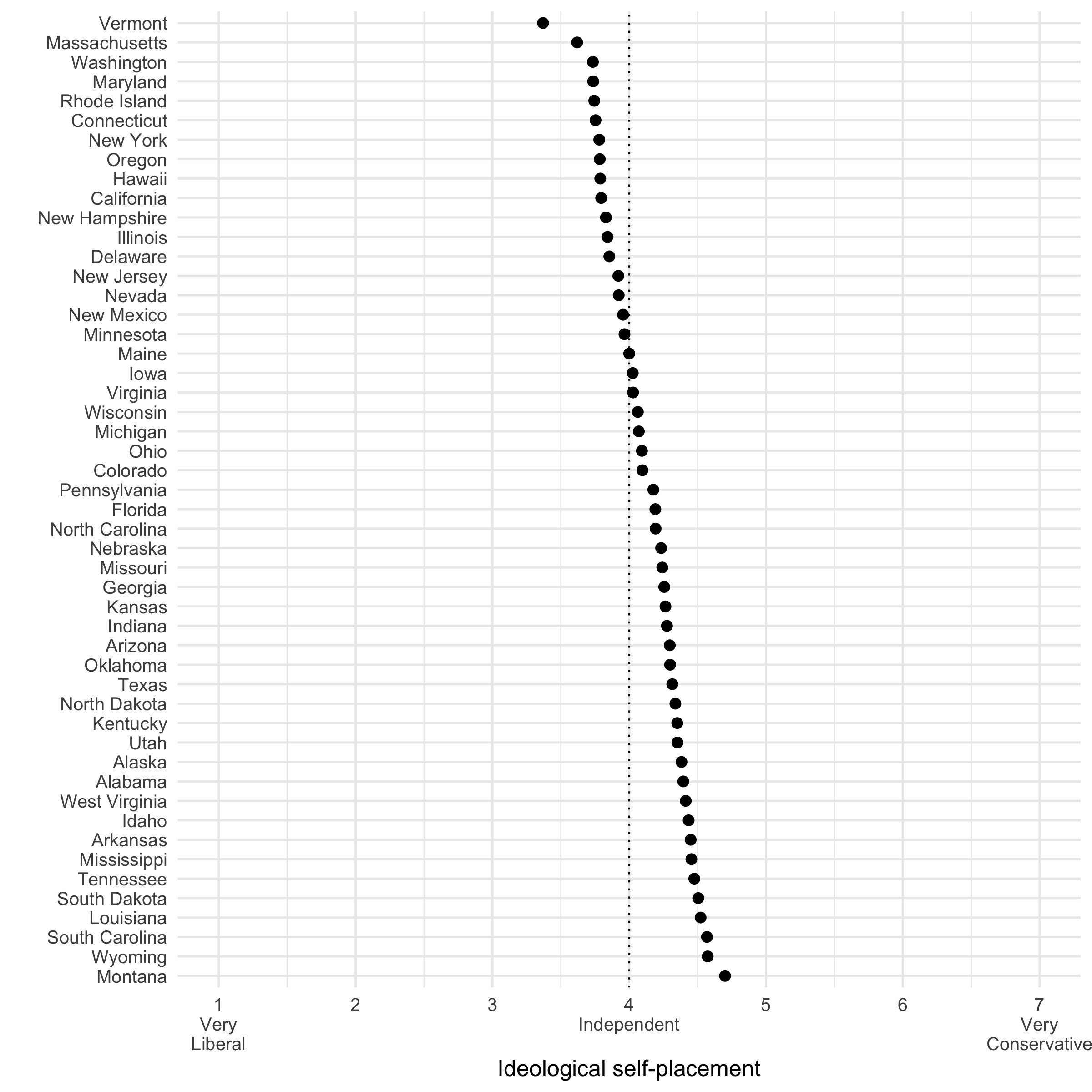
4.2. Visualizing the variable of interest, aggregated across states
Note: You are not required to write anything in this section (other than providing your graph).
In this section, you will graph the mean of your variable of interest for each state. (Note: an example graph will be shown further below)
- For each state in the dataset (use
inputstateas the variable indicating a respondent’s state), calculate the mean of your variable of interest.- The resulting dataset should have 51 rows (one for each state, plus an extra observation for those living in the District of Columbia). Each column will indicate the name of the state; each row, the mean of your variable of interest.
- Remove the District of Columbia from the data so that your data contain only 50 rows, one for each state.
- Reorder the state variable so that the states in the graph will be ordered from the highest value of your variable of interest to the lowest (or vice versa).
- Visualize the data so that the name of the state is on the y axis, and the mean of your variable of interest is on the x axis.
- Use your best judgment to improve the graph by, for example, labeling the axes and legend, moving the legend to the top, changing the size, color, and fill of the points, etc.
- Include this graph in your assignment.
An example of the resulting graph for the ideological self-placement variable might look like this:
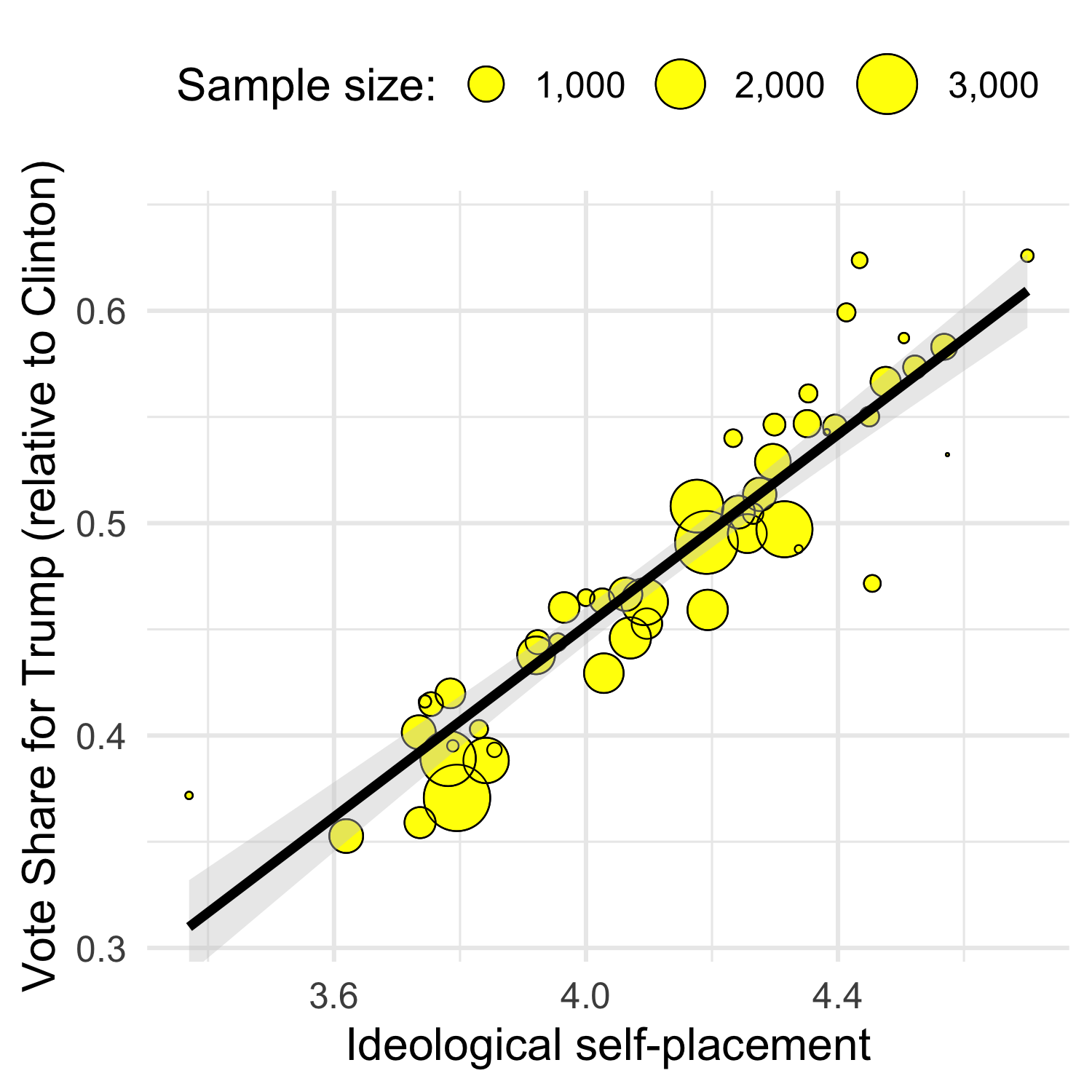
4.3. Visualizing the relationship between the variable of interest and vote share for Trump
Note: This section will likely require around 1 paragraph of writing (in addition to your graph).
In this section, you will be required to graph the bi-variate relationship between the mean of your variable of interest in each state and the vote share for Donald Trump.
- Modify the code you used in Section 4.2 to also calculate the mean vote share for Donald Trump (relative to Clinton) in each state. The vote choice variable in the data is called
CC16_410a. Note: Because some people vote for candidates who are not Trump or Clinton, make sure you also remove non-Trump, non-Clinton voters from the data. - Modify your code to also calculate the sample size in each state (among those people who say that they will vote for Trump or Clinton).
- Visualize the relationship between the mean of your variable in each state (on the x axis), and the vote share for Donald Trump (on the y axis).
- Make the size of each point proportional to the sample size in each state.
- Include a linear regression line in the graph. Note: the default for
geom_smooth()is a LOESS (smoothed/curved) regression line. Determine what argument you need to include in thegeom_smooth(??? = ???)function so that the regression line is linear (i.e. an OLS regression line). - Use your best judgment to improve the graph by, for example, labeling the axes and legend, moving the legend to the top, changing the size, color, and fill of the points, etc.
- Include this graph in your assignment.
- [Deleted]
- Lastly, provide an interpretion in writing of the relationship—or lack thereof—that you observe in the graph that you have produced.
An example of the resulting graph, for the ideological self-placement variable, might look like this:
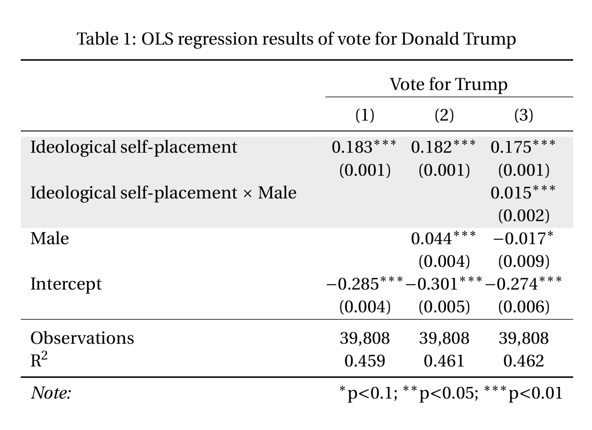
4.4. Regression
Note: This section will likely require around 2-4 paragraphs of writing (in addition to your regression table).
In this final section you will run three linear regression models using the original individual-level data to predict whether a respondent voted for Donald Trump instead of Hillary Clinton (with all other candidates excluded). Make sure you do not use the aggregate data that you generated from sections 4.2 and 4.3 above, i.e. use the original data such that a single row refers to a single survey respondent.
- [Deleted this step because it is unnecessary and caused confusion. Start at 2.]
- For your first regression model, fit a linear regression such that:
- The independent variable is your variable of interest.
- The outcome variable is voting for Donald Trump (voting for Trump = 1; voting for Clinton = 0). Note: recall that the vote choice variable is
CC16_410a.- Note: Using OLS on a binary outcome results in heteroskedastic standard errors. A standard OLS model (i.e. with
lm()) will thus have incorrect standard errors (i.e. your p-values will be wrong, which is bad). To correct this, you need to use robust standard errors. This is not required for the assignment because I just want you to learn R in this assignment… But if you want to have the correct standard errors as you would need in an academic paper, you can modify yourlm()model object like this:your_model_robust_se <- coeftest(your_model, vcov = vcovHC)(requires the librariessandwich&lmtest).
- Note: Using OLS on a binary outcome results in heteroskedastic standard errors. A standard OLS model (i.e. with
- Fit a second regression model to the data using the same specification as in step (2.), but include a control variable of your choosing (select it from the codebook). Note: You may have to do some recoding of your control variable as well. You can also include multiple controls if you so choose.
- Fit a third regression model to the data using the same specification as in step (3.), but include an interaction term between your variable of interest and your control variable. Note: you will likely need to Google or refer to the documentation to determine how to do this.
- Include a regression table in your assignment that includes all three regression models (for an example, see the image below). Note: It is suggested that you use the
modelsummarylibrary to generate the regression table. See the slides/exercises from the OLS lecture. - [DELETED]
- Describe the results of each regression model for your variable of interest (that which includes only your variable of interest; that which includes the control(s); and that which includes the interaction term). Note: Because the outcome variable is a binary variable (voting for Trump, rather than Clinton), this model is called a “Linear Probability Model”. The coefficients can therefore be interpreted in terms of an expected increase (or decrease) in the probability of voting for Donald Trump.
- Explain the extent to which the results of your regression models can be interpreted as the causal effect of your variable of interest.
5. Submission
Please submit your assignment as a single PDF file and your R file. Your code should be fully commented so that it is clear that you know what each piece of your code does. I should be able to simply change the working directory and run the code in full, so make sure that, in principle, it would be replicable if you run the code on someone else’s computer.
If you work in a group, only one group member needs to submit the assignment. Just put each of your names on the title page.
Submit your assignment (the PDF & R file) on Absalon under “Assignment 1”.